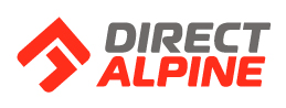
NEW logo DIRECTALPINE
DIRECTALPINE is your direct route to the top, a direct route to the goal, to the given purpose, to perfection, without any deviations, sidesteps and compromises.
The symbol of the logo significantly influences the formation of brand awareness, and so it is important for values of the brand to be reflected in it.
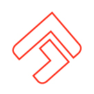
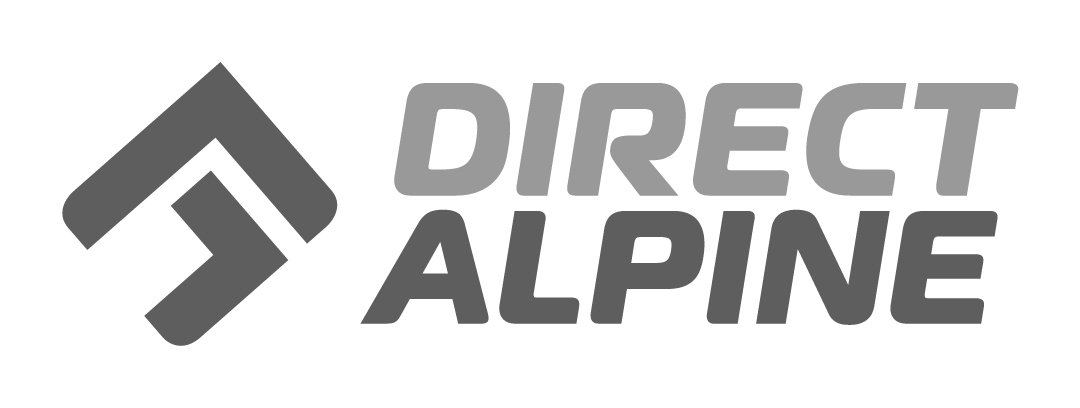
The graphic element of the Direct Alpine logo contains several clearly stated symbols which help define the necessary brand values.PEAK AND THE UPWARD DIRECTION
The element contains the symbol of the peak - the aim of the mountaineer.
ARROW
The element contains the symbol of the arrow with a clear upward direction. The upper dominant arrow points to the direct vertical route, i.e., the "diretissima“ – which in mountaineering argot means the most direct route to the peak, thus a clear, valued and acknowledged route. The additional lower arrow overall completes the entire signpost and also points to the text of the brand. The most direct, respected and correct route runs here!
LETTERS ‚A‘ + ‚D‘
The element also represents an elegant graphic combination of two letters - the "A" roof and the lower cutaway of the letter "D".
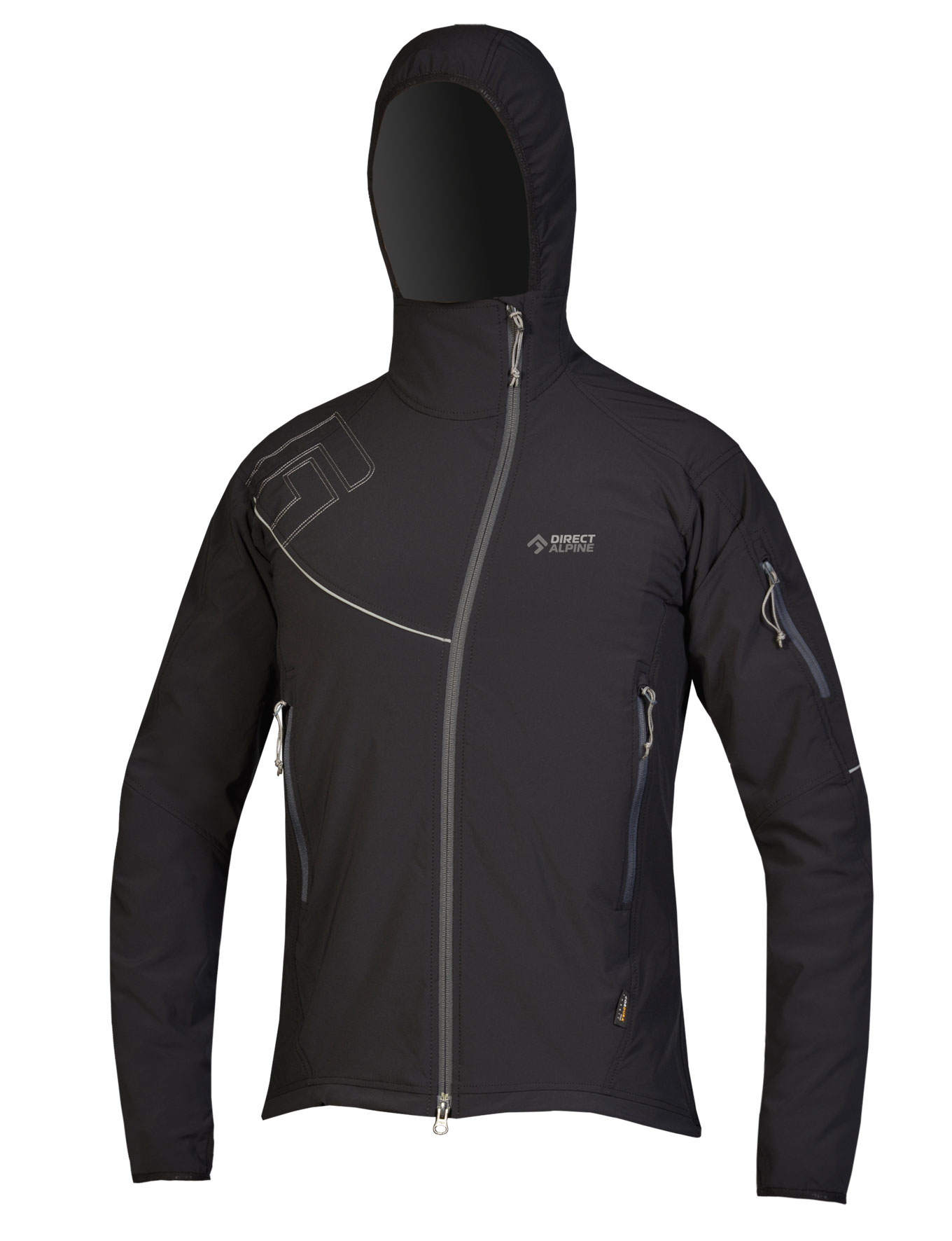
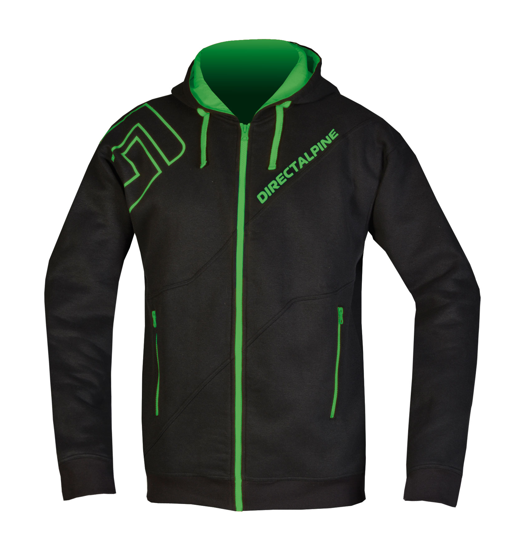
Nové logo dovoluje provedení, jak jednořádkové, tak i dvouřádkové, které je nyní používáno pro označení výrobků. Díky tomu je značka DIRECTALPINE lépe čitelná a identifikovatelná.
2 Lines:
Wide:
Symbol: